One-Pager Rebrand — STO Building Group
Redesigned the company’s core marketing sheet. Applied refreshed branding to create a flexible, easy-to-update format.
Role: Graphic designer
Deliverables: Double-sided 11” x 8.5” digital and print-ready fact sheet
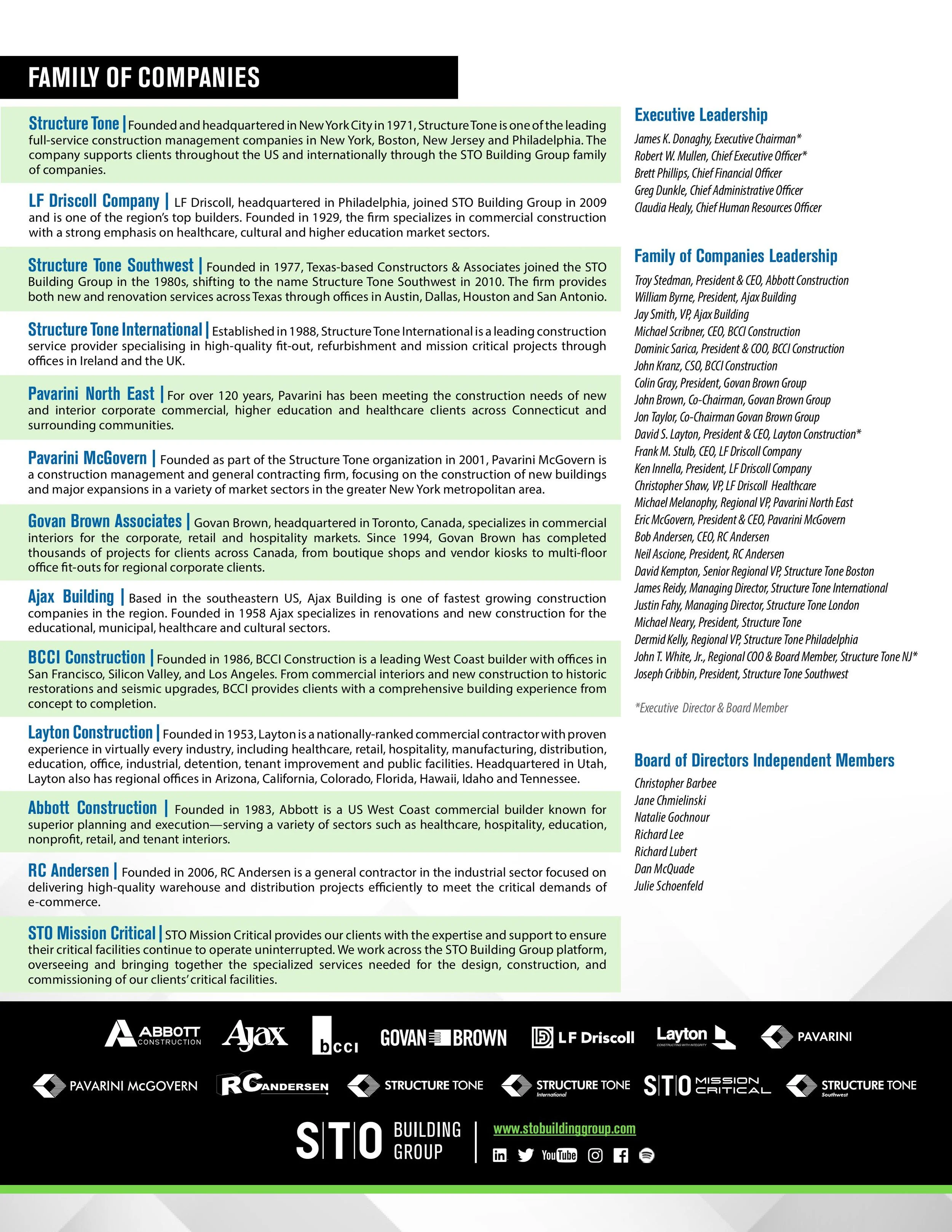
I was tasked with revamping our company’s current Company Snapshot to reflect our most recent language and branding style. The document’s content was a coordinated effort between myself, marketing managers, and leadership. Our Company Snapshot is part of the “STOBG Story” marketing toolkit; is meant for external distribution to current and prospective clients.
The one-pager is a visual refresh, designed to replace a document that required extensive changes following the company’s change in branding guidelines and external language. A limited color palette of greyscale and cerulean accents and additional white space on each page replaced a formerly cluttered layout with more accent colors than necessary. This resulted in a more clean, professional look and feel to complement the company’s overall branding shift. The change in content was a collaborative effort between leadership and marketing management.
This work is the property of STO Building Group and is used here with permission.
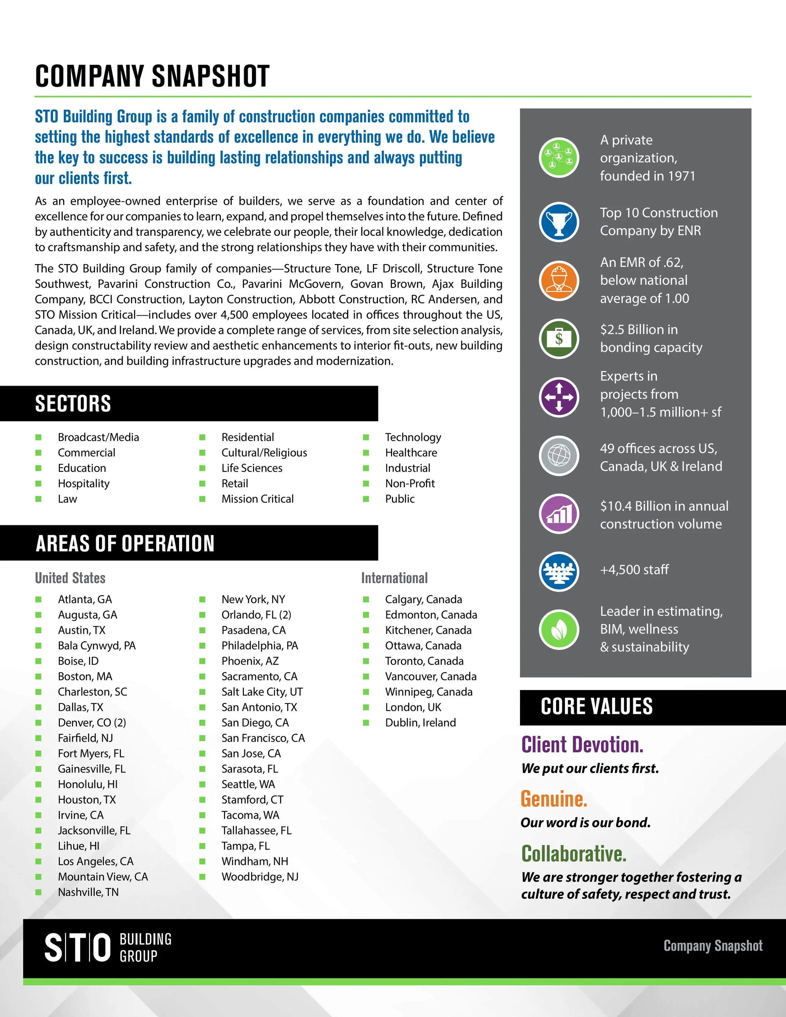
The Issues
Branding
Disorganized color palette, with excessive use of secondary branding colors
Outdated color palette and brand language
Spacing
Cluttered layout with too little negative space
Text-heavy sections consuming too large of an area
Content
Vertical format is not screen-friendly
Too much text; not visually appealing
The Refresh
Updated branding colors and language
Visual area map to replace list of locations
Reduced text and increased negative space
Screen- and print-friendly orientation
New fonts to better establish hierarchy